What if your campaign headline walked the runway? Imagine letters stitched like seams, headlines cut on bias, and punctuation accessorized like jewelry. In this world, typography isn’t just content—it’s clothing.
To prototype the look quickly, many creatives start with an AI photo generator for moodboards and fabric-like textures, then translate those vibes into letterforms. And because Dreamina makes visual iteration feel like a fitting room for ideas, we’ll fold in a compact Dreamina workflow a little later.

Table of Contents
- 1
- 2 Runway alphabets and couture letterforms
- 3
- 4 Wardrobes for words: building a typographic capsule
- 5
- 6 Cut, hem, and stitch: typographic tailoring moves
- 7
- 8 Textures that talk: fabric-thinking for type
- 9
- 10 Monograms that move: sound, motion, and symbol
- 11
- 12 Accessorizing the alphabet: punctuation as jewelry
- 13
- 14 From sidewalk to screen: styling type for social
- 15
- 16 The atelier in your pocket: limited drops and collectible type
- 17
- 18 Backstage with Dreamina: The five-minute fitting room for letters
- 19
- 20 Choreography for type: pacing that feels like a catwalk
- 21
- 22 Styling guides as lookbooks
- 23
- 24 Capsule campaign ideas (ready to wear)
- 25 Fitting notes: how to keep fashion-forward type readable
- 26
- 27 Ending look
Runway alphabets and couture letterforms
Type has always had posture—upright serifs, breezy scripts, swaggering slabs. Fashion-forward campaigns turn that posture into costume. Think: a heavy display font rendered as quilted puffer letters marching down a winter billboard, or airy geometric caps “pleated” into sunburst gradients for a summer series. The trick is to treat weight, contrast, and spacing as drape, cut, and tailoring.
When you dial in the silhouette of a word the way a stylist sculpts a look, your line breaks, hyphens, and even ellipses start behaving like garments and accessories. The message still speaks; now it struts.
Wardrobes for words: building a typographic capsule
Capsule wardrobes thrive on a few versatile pieces. Typography can do the same—create a kit that dresses messages for many contexts without losing brand DNA.
-
A base face that handles body copy with unflappable clarity
-
One headline diva for drama and drop shadows
-
A “textile” variant (patterns, emboss, bevels) as your statement coat
-
A micro-accessory set—icons, ornaments, and end marks—for visual rhythm
This capsule lets you switch from posters to stories to OOH without redesigning the brand each time. Same vibe, fresh outfit.
Cut, hem, and stitch: typographic tailoring moves
Fashion metaphors become layout tactics when you give letters a seamstress’s attention:
-
Kerning as tailoring: tighten pairs like a custom waist; loosen to signal breath or ease.
-
Leading as hem length: short for punchy, tall for elegance; alter it per “occasion.”
-
Contrast as fabric weight: high-contrast Didones feel like silk; mono-stroke sans can read as crisp cotton.
-
Negative space as lining: carve counters and margins to echo lapels, vents, and pleats.
These subtle alterations keep your headlines looking fitted rather than off-the-rack.
Textures that talk: fabric-thinking for type
Texture can push a word from “readable” to “wearable.” Denim grain across a chunky grotesk makes it casual. Satin highlights on a calligraphic stroke send it eveningwear. Holographic bevels spin letters into festival attire. Done with restraint, these treatments become repeatable brand textiles.
Monograms that move: sound, motion, and symbol
A great monogram is jewelry for the brand. Add motion, and it becomes a kinetic brooch. If you’re ideating compact emblems that need to survive on the favicon scale and still sparkle on billboards, Dreamina’s AI logo generator can surface unexpected geometry. Treat those explorations as rough gemstones: you’ll cut, polish, and set the best shapes into a system of static and animated marks.

Accessorizing the alphabet: punctuation as jewelry
Commas can be charms. Asterisks sparkle like studs. Ampersands are statement necklaces. Build ornament libraries where punctuation wears consistent “metalwork”—a shared bevel, shimmer, or engraving. Suddenly a caption dot-dot-dot becomes a runway of sequins, and your brand’s smallest marks feel intentional, not incidental.
On TikTok and Reels, type behaves like a swishy dress—movement sells. On LinkedIn, it’s a well-cut blazer—clean hierarchy matters. Tailor your typographic wardrobe to the venue:
-
Short-form video: animate swashes, reveal ascenders like zippers, let counters “breathe” in time to music
-
Carousels: use page transitions as quick-changes; keep consistent kerning so the outfit reads as a set
-
Stories: bold textiles, minimal copy—like street style snaps, they should feel immediate
A consistent palette ties it all together, the way a signature lining appears across every garment in a collection.
The atelier in your pocket: limited drops and collectible type
Streetwear has taught us the power of the limited run. Typography can borrow that energy. Release micro-editions of stylized headlines—embossed PNGs, animated GIF loops, or foil-look title treatments—as seasonal “drops.” The scarcity nudges sharing and turns a line of copy into a collectible.
If you translate those headline textiles into real-world takeaways, Dreamina’s sticker maker can bridge screen and street: foil-look wordmarks become die-cuts that fans place on laptops, water bottles, and guitar cases—portable couture.
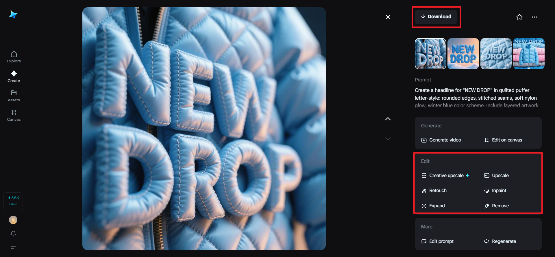
Backstage with Dreamina: The five-minute fitting room for letters
Step 1: Create a text prompt
Go to Dreamina and create a concise prompt outlining your typographic apparel: style, metaphor for fabric, illumination, and output requirements. With its text-to-image feature, you can visualize your outfits effectively.
For instance: Create a headline for “NEW DROP” in quilted puffer letter-style: rounded edges, stitched seams, soft nylon glow, winter blue color scheme. Include layered artwork for poster and social crop.

Step 2: Refine parameters and create
Choose a model for illustrative detail. Specify aspect ratio for the destination where it will be placed (poster, story, square) and size for your canvas; select 1k resolution for fast fittings or 2k for sharp finishing. Press Dreamina’s icon to create several looks, then examine silhouettes, seam detail, and legibility at small sizes.

Step 3: Edit and download
Refine unsightly stitch joins using features to upscale, add protective margins, eliminate stray artifacts, and retouch highlights to create a believable textile texture. When your headline reads like it’s ready for the runway in all placements, click Download to export production files to layout and motion.
Choreography for type: pacing that feels like a catwalk
Static posters can still move—in the mind. Build rhythm with stepped baselines (like a staggered heel-to-toe), use repeated glyphs as a drumline, and create “poses” with deliberate line breaks. In motion assets, treat every entry and exit like a model’s turn: not abrupt, but intentional—letters swivel, rest, then glide off.
Micro-sound design helps: a soft whoosh on ascenders, a zipper sound on a sliding rule, a tiny chime on an asterisk reveal. You’re not just reading; you’re attending a show.
Styling guides as lookbooks
Traditional brand guidelines can feel like dress codes. Reframe them as lookbooks. Pair usage rules with styled examples: one page per “outfit,” showing headline variants, punctuation jewelry, pattern fills, and a mood note. Designers and social teams now browse, pick a fit, and step onto the timeline.
Capsule campaign ideas (ready to wear)
-
The pleated poster wall: stack letter pleats across a street installation; each poster is a fold, the wall becomes a skirt.
-
The monogram charm drop: monthly animated monograms as 3-second loops, each with a distinct “metal.”
-
The textile story series: stories that swap fabric finishes on the same headline—denim Monday, velvet Wednesday, hologram Friday.
-
The punctuation runway: carousel where commas, dashes, and brackets strut as accessories; final slide shows the full outfit (headline + accents).
Fitting notes: how to keep fashion-forward type readable
Couture is fun, but nobody wants a headline that trips the reader. Keep contrast between letter and “fabric,” test counters at small sizes, and avoid over-ornamenting narrow weights. Most importantly, preview on dark and light backgrounds to ensure your seam highlights don’t fight the message.
Ending look
When typography dresses like fashion, campaigns feel tactile and alive—headlines swish, monograms glitter, punctuation winks. With a design capsule, motion-aware choreography, and small collectible touchpoints, your words stop sitting on the page and start owning the room. Dreamina makes the fitting room frictionless: sketch a mood, spin variations, finesse details, export. Dress your message well and it won’t just be read—it’ll be remembered.